You are a free subscriber to Me and the Money Printer. To upgrade to paid and receive the daily Capital Wave Report - which features our Red-Green market signals, subscribe here. It's Time to Chart Party... (No. 4 is Nuts)I just took a deep breath, counted backwards from ten and I said to the guy, "Excuse me, sir, but your laughter is not helping me right now." And he said, "I'm sorry, I didn't mean to make fun."
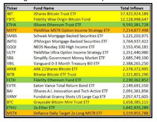
Good morning: My wife and daughter have taken a trip to visit family in North Carolina… Which means that I am sitting on the couch - for as long as possible - engaging in the nerdiest and most blissful thing there is… Charts. Charts! Charts! Charts!!! So, we’re going to go through A LOT of charts today… And some won’t require too much commentary. We start with the sheer lunacy of our financial markets… Chart 1: This Is What Our Engineers DoAs I’ve said, there are better incentives these days for people to launch ETFs than to build a bridge, start a business, or make anything in this nation. Just raise a pool of capital, buy a bunch of stuff… and then collect an expense ratio. Everyone is doing it. According to Finviz, there are 5,533 publicly traded stocks… And 4,436 ETFs… they’re all repackaging the same stuff or just levering up positions on single stocks or index funds with swaps. And then taking daily fees… Since 2024, there have been more than 1,300 new ETFs. And the ones with the highest inflows… what are they “trading…”
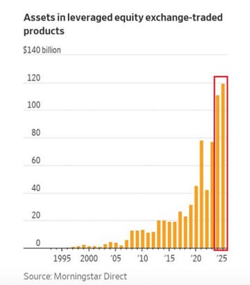
Don’t try to make sense of most of the assets in these ETFs, or you’ll get a bloody nose, slam your head into the desk, and you’ll wake up in an ambulance. Chart 2: It Gets WorseNow, you don’t see a lot of leverage in these ETFs above. Which is good news for the sane… until we dig a little deeper. Total assets now in equity exchange-traded products (ETFs and ETNS) just hit $140 billion. And no doubt about it… we got clear evidence of how these tools are being traded (read - front run) out of Washington D.C.
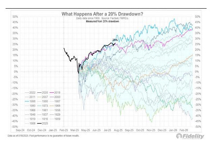
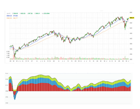
Recall, right before Liberation Day was canceled… we saw RECORD volume around the ProShares UltraPro QQQ (NASDAQ: TQQQ), which is a 300% leveraged ETF tracking the Nasdaq 100. I don’t believe in coincidence. Watch these funds… watch the money flows… because big events are happening after the volume spikes. Again, I don’t believe in coincidence… Chart 3: This Has Never Happened BeforeFrom record buying on April 8-9, around the TQQQ (a day after people were warning about another Great Depression), to the monstrous V-shaped recovery that’s happened. Historically, after 20% drawdowns, this is the FASTEST and SHARPEST recovery in history over the timeframe.
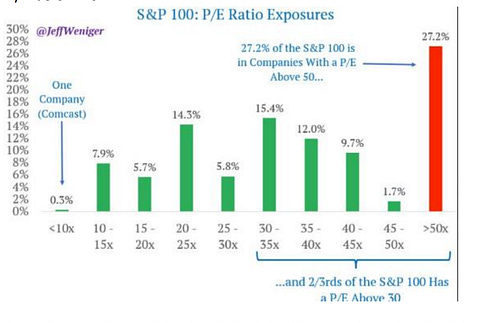
What is the lesson here? We’ve had multiple sharp drawdowns like this going back to 2008. Every single drawdown… follows the same pattern and offers us the same clues in terms of when it’s time to buy back in… Sharp insider buying activity (CEOs and CFOs have called the bottom of every downturn since the start of QE in 2009). Then, we look for policy accommodation… (on monetary, fiscal, trade, or anything designed to reintroduce stability and confidence. Sometimes, it’s subtle… so watch the insiders.) Follow the 1% pattern that I’ve laid out… Chart 4: Overvalued… YOU’RE OVERVALUED…Right now, of Money Managers (according to Bank of America) believe that stocks are overvalued.
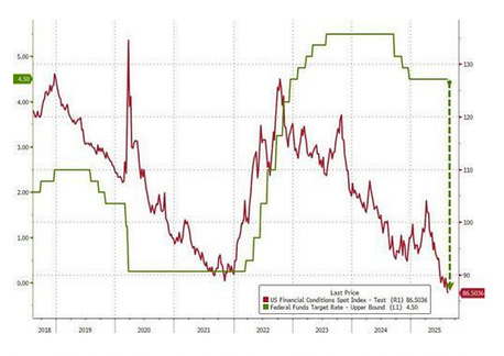
Who are the 9% who disagree? I want to hang out with these guys… Because they might understand that it’s really a measurement of leverage and liquidity that continues to drive the S&P 500 higher. And… are they like me, where they look down to the Russell 2000 and see dozens of energy stocks (upstream) trading for less than their book value… or the hundreds of banks trading for less than their tangible book value… That incentives… easing… and massive gobs of liquidity are domestically forcing equities higher - and managers are crowding the S&P 500 because they’re tracking their benchmark… And before you tell me that we’re not easing right now in the financial markets… Chart 5: Ahead of Jackson HoleHere’s your measurement on economic conditions in the United States… Believe it or not… we’re effectively running the loosest financial conditions in the post-COVID era…
Gee… “How can stocks be at all-time highs?” the pundits ask… Because if you turn the Chicago Financial Conditions Index upside down, it’s just an inverse reflection of the S&P 500 since COVID.
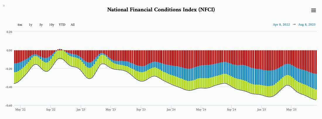
See all that red? That’s risk expanding… See all that blue? That’s credit expanding… See all that green? That’s leverage expanding… The market is supposed to predict growth over the next six to 12 months. But it doesn’t seem to do this now...
It’s reacting to liquidity flows in real time. Since 2020, stock prices have stopped caring about silly things like "profits" or "growth." Here’s what moves markets now:
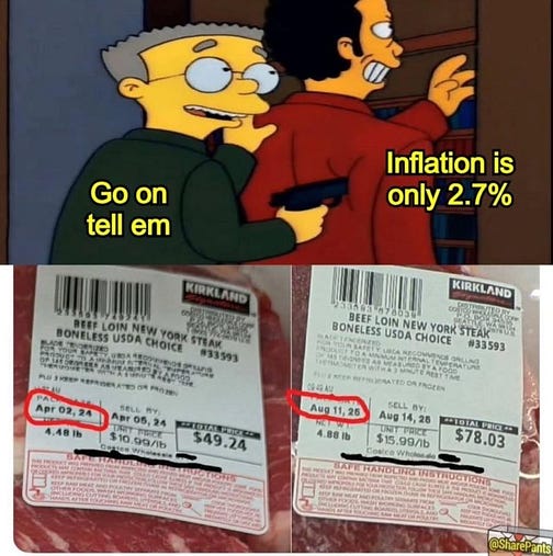
In short… Chart 6: And Then We Wonder…This is the meme going around about inflation that is slightly off… but feels on par with how conditions are in the United States. I’ve said that there are issues with the beef industry right now - smaller herds, drought, aging farmer populations.
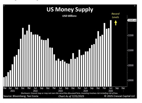
But… there’s an important thing that people have to understand. Input costs (feed, electricity, etc.) are going up… Output costs (the price of beef) are going up… That’s not supply chain or supply side driven. Monetary inflation and the phenomenon of inflation from a policy side is very real… and it doesn’t matter how many times Janet Yellen lies about it… they printed too much money. Chart 7: Proof They Printed Too Much Money…This is just the U.S. money supply… Submitted without a lot of commentary…
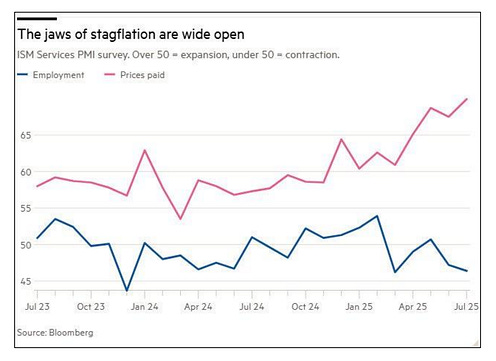
More importantly, it doesn’t include the shadow banking side that is heavily influenced by Fiscal policy… And we wonder why stagflation is a threat… Chart 8: This is TerrifyingPrices up… employment down (thus wage inflation not keeping up… If this trend continues, the midterm elections could be mayhem.
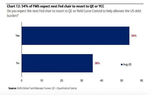
Chart 9: And Yet…Despite the concerns about inflation and stagflation… Markets actually expect that the next Fed Chair will need to engage in new forms of Quantitative Easing or Yield Curve Control…
There will need to be some sort of yield compression to address the rising deficits… Which again… is bullish for stocks… and keeps the K-shaped recovery going…
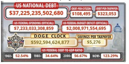
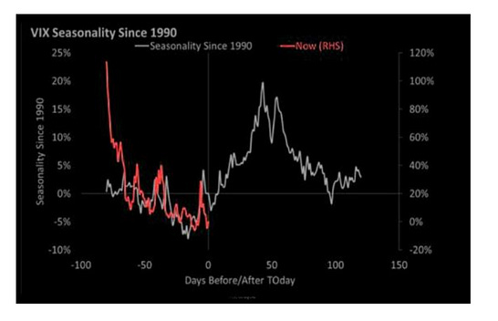
Buy hey… LOOK AT THOSE DOGE SAVINGS… HAHAHAHAHA… Buy real assets… buy things that matter… own land and gold… Chart 10 - And Finally… Past Performance Does Not…Nice little chart here… historically, since 1990, things get a little more intense heading into the Jackson Hole Symposium and September. With liquidity strong, financial conditions supportive, and markets at all-time highs… remember that the purpose of a market is to sell…
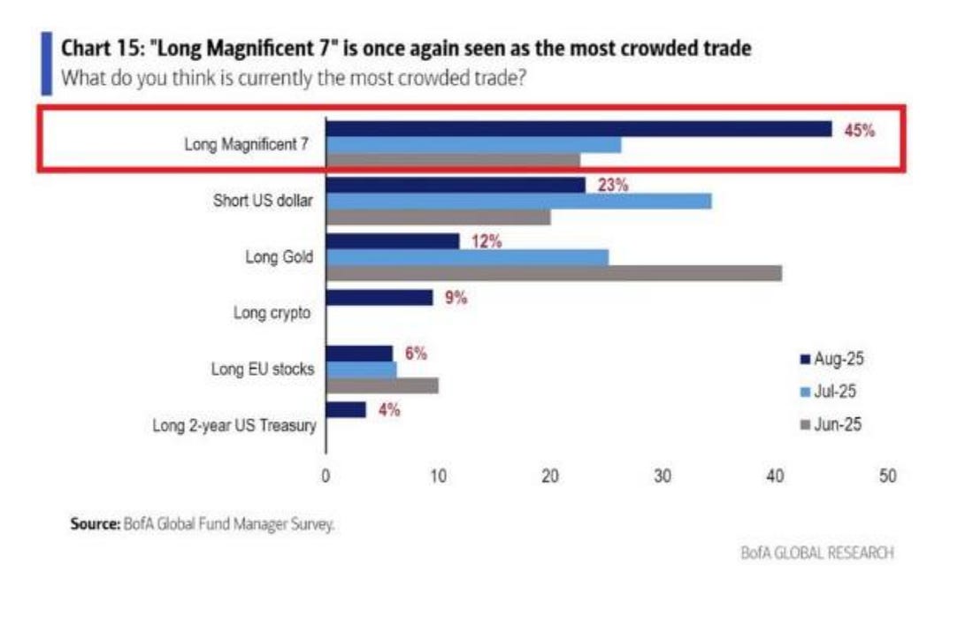
But I don’t like shorting unless there’s something significant happening. We have moved back into positive momentum conditions on the Russell 2000… And we’ll be watching two things in the next few days… First… go back to what we talked about above with LEVERAGED ETFS. The Direxion Daily Small Cap Bear 3X Shares (TZA) is a very important clue on the small-cap side. It goes up 3x for every 1% that the Russell 2000 Index loses…Look at the 20-day and 50-day EMA. If we break about those levels… that’s where I’d get jitters… Meanwhile, the FNGD is our leveraged FAANG ETN, which is a warning sign on leverage unwinding at the top of the S&P 500. If that breaks its 20-day moving average (to the upside) then you might want to speculate on more volatility. I prefer to wait for confirmation of it breaking above both its 20-day and 50-day moving averages. The last three times it has happened, we had the Nikkei crash last August, the China deflation scare last September, and the most recent market downturn starting in February and carrying into April. That’s our canary… And there’s good reason to expect something big at some point… The Mag 7 stocks are easily the most crowded trade on Wall Street…
For now… the bird is still breathing… If you need me, I’ll be at the pool today, still gathering my tax documents… I hope you have a great Saturday… If you’re not a member of the Capital Wave Report - please consider… If you thought this free commentary was great… wait til you see what I write about each morning. Oh… and just for reference… The Subhead from today’s article was from Me, Myself and Irene… Stay positive, Garrett Baldwin About Me and the Money Printer Me and the Money Printer is a daily publication covering the financial markets through three critical equations. We track liquidity (money in the financial system), momentum (where money is moving in the system), and insider buying (where Smart Money at companies is moving their money). Combining these elements with a deep understanding of central banking and how the global system works has allowed us to navigate financial cycles and boost our probability of success as investors and traders. This insight is based on roughly 17 years of intensive academic work at four universities, extensive collaboration with market experts, and the joy of trial and error in research. You can take a free look at our worldview and thesis right here. Disclaimer Nothing in this email should be considered personalized financial advice. While we may answer your general customer questions, we are not licensed under securities laws to guide your investment situation. Do not consider any communication between you and Florida Republic employees as financial advice. The communication in this letter is for information and educational purposes unless otherwise strictly worded as a recommendation. Model portfolios are tracked to showcase a variety of academic, fundamental, and technical tools, and insight is provided to help readers gain knowledge and experience. Readers should not trade if they cannot handle a loss and should not trade more than they can afford to lose. There are large amounts of risk in the equity markets. Consider consulting with a professional before making decisions with your money.
|


Subscribe to:
Post Comments (Atom)
0 Response to "It's Time to Chart Party... (No. 4 is Nuts)"
Post a Comment