You are a free subscriber to Me and the Money Printer. To upgrade to paid and receive the daily Capital Wave Report - which features our Red-Green market signals, subscribe here. It's a Saturday Chart Party...All right... I have to move over to Postcards... so let's get this Party started...
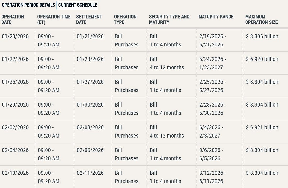
Dear Fellow Traveler: It was only supposed to be a dusting… the weather experts said there was a chance of a light mist, but no reason to go to the store. Well, here we are, out on the Edge of the World Farm, watching the fourth inch build on my uncovered Weber grill (don’t worry, it’s not like we ever use it…) We’re light on milk. Light on patience. And down to one television with cable… on a day when my daughter is sick, and the Buffalo Bills game starts at 4:30. These don’t sound like party conditions. But the rule goes like this… You have to learn to make your own fun… Let’s chart party… Chart No. 1: BRRRRRemember, everyone… this is totally NOT Quantitative Easing… But the Federal Reserve will soon engage in one of the largest campaigns of buying U.S. debt… in history.
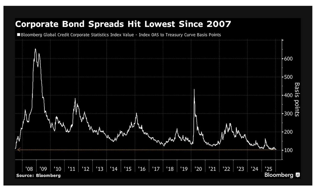
This schedule shows the Federal Reserve quietly buying short-term Treasury bills to stabilize money markets. They’re purchasing 1–4 month and 4–12 month bills in $6–8 billion increments, targeting the front end of the yield curve rather than long-term bonds. This isn’t QE or a rate-cut signal. It’s trying to clear the plumbing. Heavy Treasury bill issuance and uneven demand can strain repo and funding markets. These purchases absorb excess supply, keep front-end rates from spiking, and maintain control over short-term funding conditions. The Fed is preventing an accidental tightening while keeping policy rates high. As I said on Josh Brown’s podcast, and an upcoming podcast with Max Borders… The Fed's dual mandate of employment and inflation doesn’t appear to be its focus; instead, it focuses on financial stability. BRRRR… Chart No. 2: “Get Complacent… Get, Get Complacent…”Corporate bond spreads just hit their lowest levels since 2007… and I am here for the obvious next stage in this ongoing cycle of liquidity magic. The corporate bond spread chart is a snapshot of investor psychology. Credit spreads show how much extra yield investors demand to hold corporate debt rather than risk-free Treasurys.
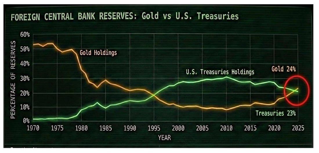
When spreads are wide, capital is scarce, and investors are defensive. When spreads compress, liquidity is abundant, and investors are comfortable taking on risk. Today, global corporate spreads are sitting at their lowest levels since 2007. That tells us credit markets are pricing in minimal default risk, easy refinancing conditions, and a broad willingness to extend leverage. It is confidence pushed to an extreme. Now layer that onto an S&P 500 chart… We tend to find ourselves in much tighter bond spreads not long before markets start to unwind… The reason is tied to liquidity. Central bank balance sheets, fiscal issuance, and funding conditions expand and contract. During liquidity upswings, leverage grows, asset prices rise, and credit spreads tighten. During downswings, funding tightens and spreads widen quickly. The current alignment matters. Ultra-tight credit spreads are appearing near the upper end of a liquidity wave, not at its beginning. This does not mean a crash is imminent. Liquidity peaks can persist longer than expected. But it does mean the margin for error is thin. Credit markets tend to turn before equities. When liquidity stops expanding, spreads usually widen first, quietly at first, then suddenly… and then… everyone says that “no one saw the crash coming…” It’s coming. It’s just perpetually delayed by policy for now. Chart No. 3… Gold Isn’t PeakingThis chart captures one of the most important shifts in global finance. It shows how central banks allocate trust.
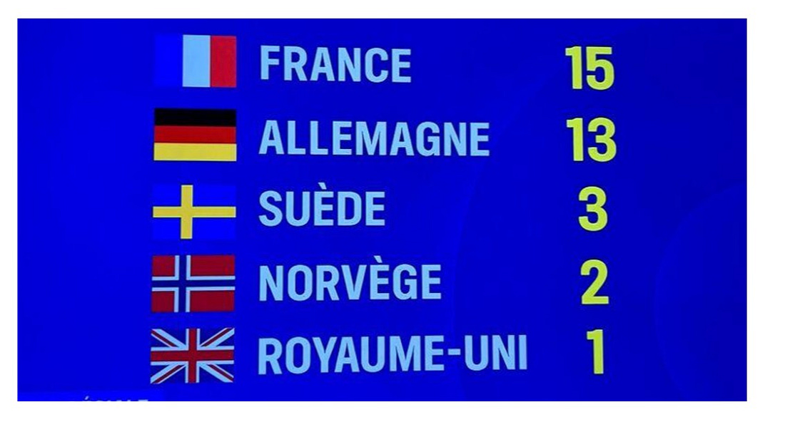
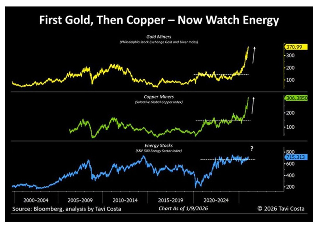
It tracks foreign reserve holdings of U.S. Treasuries versus gold since 1970. After Bretton Woods, the dollar became the world’s reserve currency, initially backed by gold. When the U.S. left the gold standard in 1971, the dollar floated, but its dominance grew as global trade and debt became dollar-denominated. Nations needed Treasuries because they needed dollars. That dynamic has changed. Over the past decade, and especially since 2022, central banks have steadily shifted away from Treasuries and toward gold. We can see the U.S. weaponizing the dollar against China as a major catalyst in the post-COVID years. The trend accelerated after the U.S. froze Russia’s dollar reserves, reminding policymakers that dollar assets carry political and sanctions risk. Gold does not. Today, gold has surpassed Treasuries as a share of global reserves. Demand is reinforced by persistent central bank buying and rising purchases from China amid currency pressure. This is not a short-term trade. Gold has re-established itself as a permanent reserve and investment anchor. With rising debt, recurring monetary easing, and a more fragmented global order, gold isn’t going away. It’s becoming foundational again. Chart No. 4: I’ll Take Exxon for the WinHow serious is Europe about protecting Greenland right now? They sent enough troops to play in a beer pong tournament.
I’ll take the team out of Norway… These (by country) numbers are real… BBC has them. How important is Greenland? Well… when you see the map of mineral resources and the strategic importance along the Northern Sea Routes, you realize that this is probably going to be one of the bigger speculative themes of the next three years… Greenland stocks… For the record… if that does become a search term or massive thing that investment newsletters do for the year ahead… “Greenland Stocks 2026” I’m taking Exxon (XOM) at No. 1. Not only am I bullish on energy, but Exxon has the actual engineering experience in the Arctic, not only in Alaska’s Northern Slope… but also in Russia with Rosneft. They have that engineering expertise... Chart No. 5: I’m Bullish On EnergyAgain, the U.S. economy is doing well. China is engaging in stimulus measures, which are bullish for commodities. The dollar could slow this down, which is the one important buffer here. A rising dollar leads to lower oil prices… and when liquidity cycles tighten, dollar demand historically rises (but is this time different after the sudden shift to stablecoin demand in April 2025?)
We are entering a period of commodity speculation, historically during our liquidity cycle. I’m going long the State Street Energy Select Sector SPDR ETF (XLE). At the moment, I still think the Republicans will hold the Senate… and the actual House won’t be settled until mid-January 2027 because of lawsuits (and the fact it will likely be a very split outcome). So, that gives me optimism on policy through the end of the year. And as always, I’m deeply in love with the midstream because of the fees and the chokepoints in electricity, AI, and more across the entire U.S. economy. Chart No. 6: Wake Up… It’s Coming…Financialization versus real shit… that’s the divide we’re in right now. With more investors waking up to a world where real things matter more and more… the era of financialized assets and ETFs that just replicate the same MAG 7 stocks over and over and over is hopefully reaching its peak. What looks like a rational place to build ETFs? How about the things that matter? It seems this is under way…
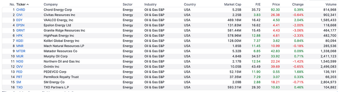
But so far we’re off to a financialized start… seems that all we know how to do… Create leverage. In the last few weeks, we've leveraged single-stock ETFs on rare-earth metals… USAX (double leveraged USAR) and CRMX (double leveraged Critical Metals Corp.)_ I mean… that’s just financialization of metals. Come on… get me an ETF that gives me exposure to actual hard commodities. And I don’t want something that tracks Zinc futures. I want the guys who pull this stuff out of the ground. Wake up, everyone… You need the things that matter in the old economy (industrialization) to build the new one (AI, EV, electrification). Chart No. 7: Incentives MatterIncentives matter. In upstream energy, they’ve shifted in ways the market still hasn’t fully priced. If oil prices recover and can hold in the $65–$75 range, the economics of many upstream producers improve faster than equity valuations tend to reflect. At those levels, a large share of U.S. production remains profitable without aggressive drilling or leverage. Cash flows currently treated as temporary start to look persistent. That’s why I’ve been watching a simple screen. There are 16 U.S. upstream producers that are profitable and trade below book value. Of those, 13 trade near 5x EV-to-EBITDA, and 7 have debt-to-equity ratios below 0.5.
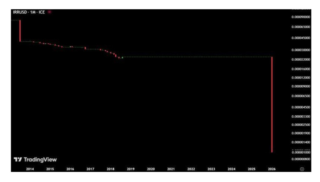
These stocks look cheap for real reasons. The sector is cyclical, capital has fled, political risk is high, and many of these companies are too small for large institutions. But those risks are well known and largely priced in. What’s changed is behavior. Higher oil prices no longer trigger uncontrolled supply growth. Capital discipline is enforced by shareholders, lenders, and management incentives. In that environment, stable prices matter more than spikes. Smaller-cap upstream firms feel this first. They hedge less, see balance-sheet repair faster, and don’t need multiple expansions or takeovers to work. If oil prices simply hold where they are, upstream equities priced for decline start to look misaligned. More than anything, I’ll just be staying long the XLE… but if we see energy momentum start to move, I’ll be looking down at this list of names and focusing on their moves above their 20-day average for hopefully sustained momentum… Give it some time. Chart 8: That’s A Shame…Iran’s currency has collapsed…
It’s nearly worth ZERO compared to the Euro right now… Chart 9: Nothing to See Here.Yeah, this totally isn’t going to cause a problem and fuel cross-border outflows in the future that may impact U.S. valuations, leverage trades, and passive investment flows.
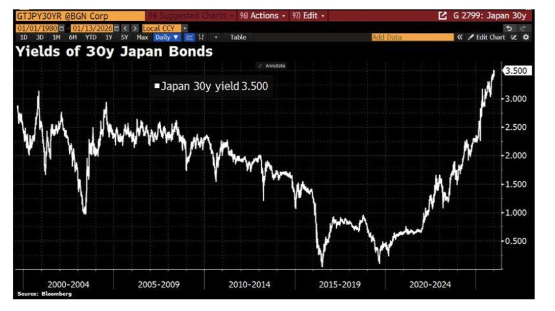
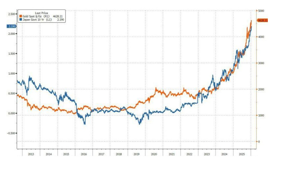
Nothing to see here… Chart 10: I said… NOTHING TO SEE HERE…Here’s Japanese 10-year bonds against Gold spot prices for over a decade…
I said… NOTHING TO SEE HERE.
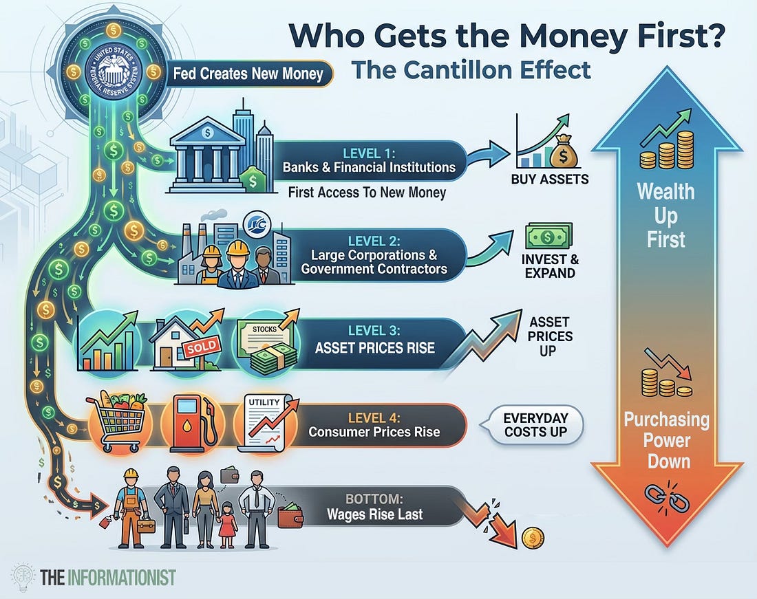
Finally, Chart 11: Who Gets the Money First…A fantastic visualization of the Cantillon Effect, which I have written about for a very long time. When money is created, it flows to banks and financial firms… they invest it in assets… which drives up their wealth. When it finally reaches the average person (in wages), money creation largely shows up as an interest expense. If you want to understand the source of inequality… it’s here. It’s not in executive compensation (which is a highly illiquid talent market with a variety of perverse incentives). It is really about how money is created and injected into our economy. And until our politicians understand this… nothing will change. Okay… onto 100 more things today before the Bills game… Capital Wave members, look for an additional email from me today… Everyone else… Please prepare for tomorrow’s Postcards from the Edge of the World. Stay positive, Garrett Baldwin About Me and the Money Printer Me and the Money Printer is a daily publication covering the financial markets through three critical equations. We track liquidity (money in the financial system), momentum (where money is moving in the system), and insider buying (where Smart Money at companies is moving their money). Combining these elements with a deep understanding of central banking and how the global system works has allowed us to navigate financial cycles and boost our probability of success as investors and traders. This insight is based on roughly 17 years of intensive academic work at four universities, extensive collaboration with market experts, and the joy of trial and error in research. You can take a free look at our worldview and thesis right here. Disclaimer Nothing in this email should be considered personalized financial advice. While we may answer your general customer questions, we are not licensed under securities laws to guide your investment situation. Do not consider any communication between you and Florida Republic employees as financial advice. The communication in this letter is for information and educational purposes unless otherwise strictly worded as a recommendation. Model portfolios are tracked to showcase a variety of academic, fundamental, and technical tools, and insight is provided to help readers gain knowledge and experience. Readers should not trade if they cannot handle a loss and should not trade more than they can afford to lose. There are large amounts of risk in the equity markets. Consider consulting with a professional before making decisions with your money.
|


Subscribe to:
Post Comments (Atom)
0 Response to "It's a Saturday Chart Party..."
Post a Comment